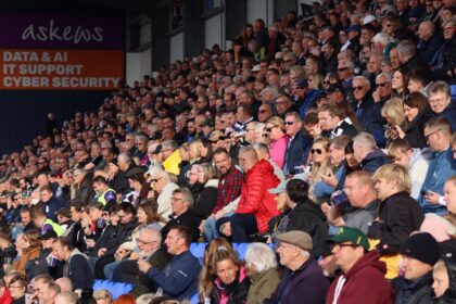
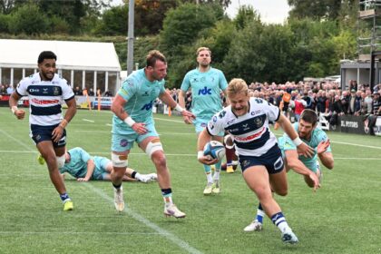
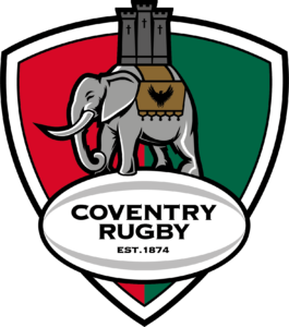
Coventry Rugby has today unveiled the club’s new crest for the 2019/20 season and onwards.
The new crest honours the long legacy and connections that the club has had with the city of Coventry for over 140 years.
At the same time it brings a modern interpretation of this heritage, re-incorporating the city’s traditional colours of red and green into the background and introducing a phoenix motif to represent the recent promotion and ambition to continue rising up the ladder of English club rugby.
“The new crest is part of the next step in our journey as a club,” says Coventry Rugby Chairman Jon Sharp.
“We are looking to continue our progression in all areas on and off the field, with more structure in the administration and more investment into the playing and coaching group as we build for the future.
“We’re also proud of our history and view this new crest as being an evolution which takes us closer to our heritage while also setting a marker for the future.”
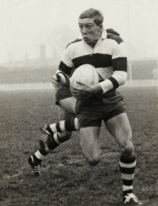
The new crest was designed by Paul Carnall of Flygun Creative. It is a project that is close to his heart, as his father, Peter, wore the Coventry hoops when the club led the way within English rugby.

“I am extremely proud and honoured for my company Flygun Creative to have delivered the new crest for Coventry Rugby,” Carnall commented.
“The opportunity to work with the club is something that is very close to my heart, not just because of me being born in Coventry but also from a personal perspective as my father played for the club between 1964 and 68, a time when they were considered one of the best teams in the British Isles, something he is immensely proud of.
“Coventry Rugby is a family club steeped in history and it has meant so much to me to have been involved in this project. We’re all looking forward to seeing the crest rolled out and Flygun playing our part in the next exciting chapter of this great club.”